
One of the most popular current website design trends is the use of hero images — large pictures that cover a large portion of the screen, often with text overlaid. Hero images are great for capturing attention and providing an immersive, captivating experience on your website, but selecting the best picture to use can be tricky. Focusing on primarily three aspects of your photos, here are some tips to help you choose the perfect hero image for your website.
Content
The most important thing to consider selecting your picture is what it shows. Consider the following suggestions for a photo that will make a great hero image:
- It captures the essence of your organization. Perhaps it is a picture of your building, a photo of your team at work, or something similar. But ensure this picture demonstrates who you are and what you’re about, because it’s one of the first things people will see.
- It will work well with text overlaid. If a picture is too busy, it could make text hard to read. If the picture contains text, you’ll likely want to blur it so it won’t obfuscate the text you display on top of it. See the “Contrast” section below for more things to consider along this line.
- You have the right to use it. Unfortunately, you can’t run a Google Image search and use your favorite result on your website. You either need to take the picture yourself, receive permission from the photographer to use the picture on your site, or download or purchase a stock photo with the appropriate rights included.
Resolution
When choosing a background image for your website, consider that it will cover most of all of your viewers’ screens. Low-resolution images will look grainy on high-resolution screens. Even many mobile devices have screen resolutions approaching or exceeding HD (1920×1080), and as we mentioned recently when discussing outdated websites, 85% of computers have a resolution at or above 1366×768. With all of this in mind, the minimum resolution you’ll want to use for a hero image is 1366×768, and you’d be wise to select an image with HD resolution or above.
That said, don’t go overboard with image resolution. As resolution increases, so does loading time. If you upload a 6000×4000 uncompressed PNG image as your background hero image, it could load very slowly on slower internet connections. A content delivery network can help speed up loading times, but there’s only so much you can do to compensate for a gigantic file. Consider using a JPG file for a smaller file size, and use a medium compression so it doesn’t have visual artifacts but you can keep the file size down.

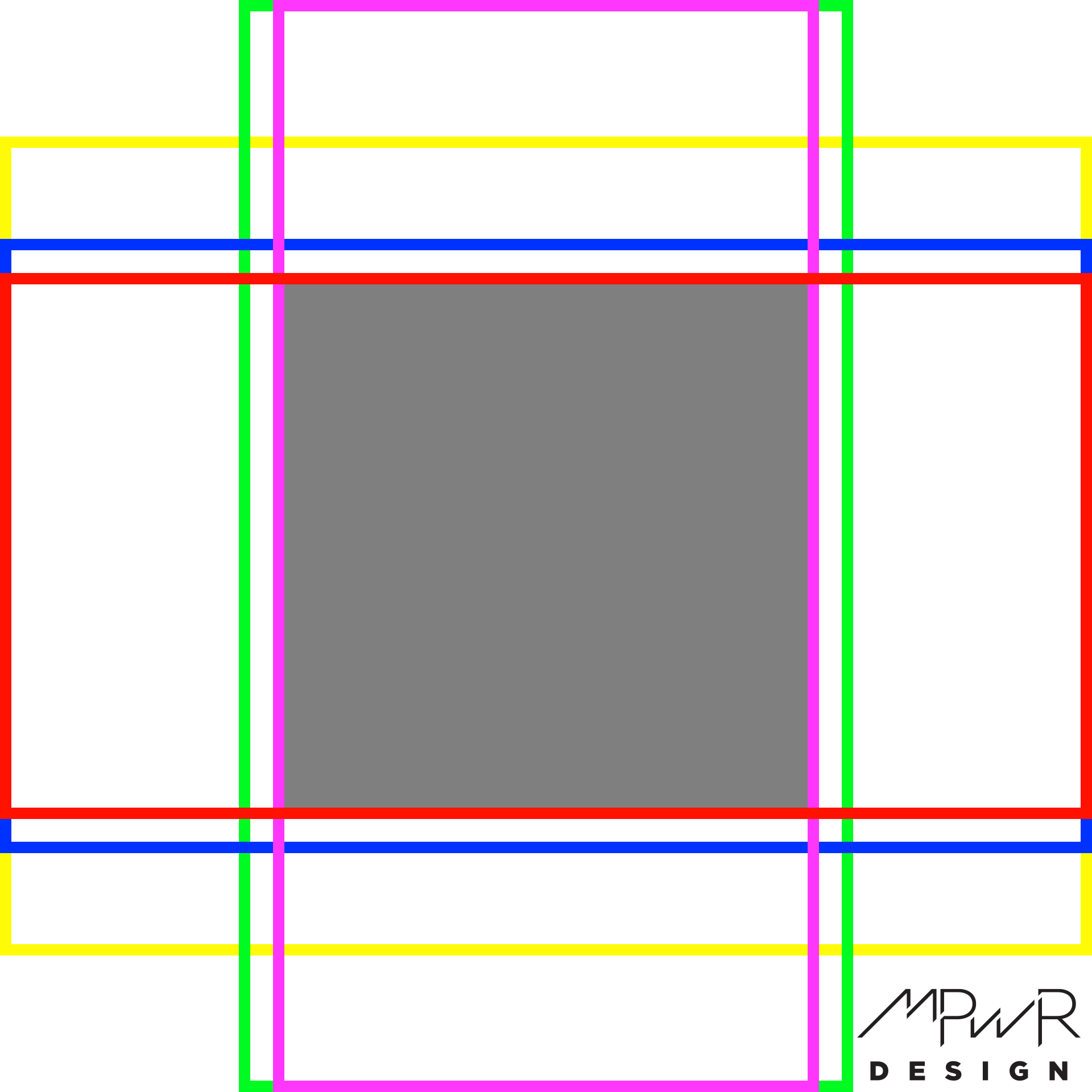
This downloadable template shows what parts of an image will be cropped based on the user’s device.
Orientation
For a full-screen hero image, consider the variety of devices that browse your site. Some computers use 4:3 screen ratios and others have 16:9 widescreen monitors. Mobile visitors probably view your site in portrait orientation but sometimes they flip their phones sideways and browse in landscape orientation. So how can you be sure your hero image looks good on a wide range of devices?
The key is to use an image that is zoomed out far enough that the subject will remain visible regardless of cropping. As seen in the downloadable image template, only the vertical and horizontal middle 50% of an image is guaranteed to be shown on any device, regardless of orientation. When you consider the screen real estate browser menu bars and tabs can take up, that space could diminish even further.
Feel free to download the hero image template here, and if you use layered image editing software like Photoshop, lay it over your image to see what parts of your image will show on any device. The yellow box shows a typical 4:3 computer monitor. The blue box shows a smaller viewing area for a 16:9 computer monitor or a cell phone held in landscape orientation. The smaller red box shows how an image is further cropped on 2:1 (18:9) phones like the iPhone X. On the other hand, images are cropped very differently on phones held in portrait orientation, as seen with the green box representing a 16:9 phone and violet box representing an 18:9 phone. The gray box in the middle of the image shows the area that is always visible regardless of the device.
As you can tell from the template image, a square image works well. If you choose a landscape image, portrait devices will crop off so much more of the image that you won’t have much left. We chose a 1920×1920 image size so that it will crop to an HD resolution of 1920×1080 vertically or horizontally.
Contrast
Contrast also plays a major factor in a good hero image choice if you’re planning to lay text over the image. Since the text will be one solid color, it needs to stand out enough from the image enough to be legible. Because the text will be placed over different parts of the image depending on the device’s orientation, it helps to have a minimal contrast throughout the image. If the image has dark areas and light areas, text will be washed out regardless of whether you choose black or white text. However, if the image is mostly dark or mostly light, you can choose the opposite for your text and ensure it will still show up. It’s also common to overlay a medium-opacity black or white color over the image to darken or lighten the image. For example, laying a 50% opacity white color over the image makes it light enough that black text will show up well. You can also overlay a medium-opacity solid color over the image to achieve the same effect. We use this technique frequently on our featured images for our WordPress tips.
